


User Research. Responsive Design. Content Development. Custom Forum.
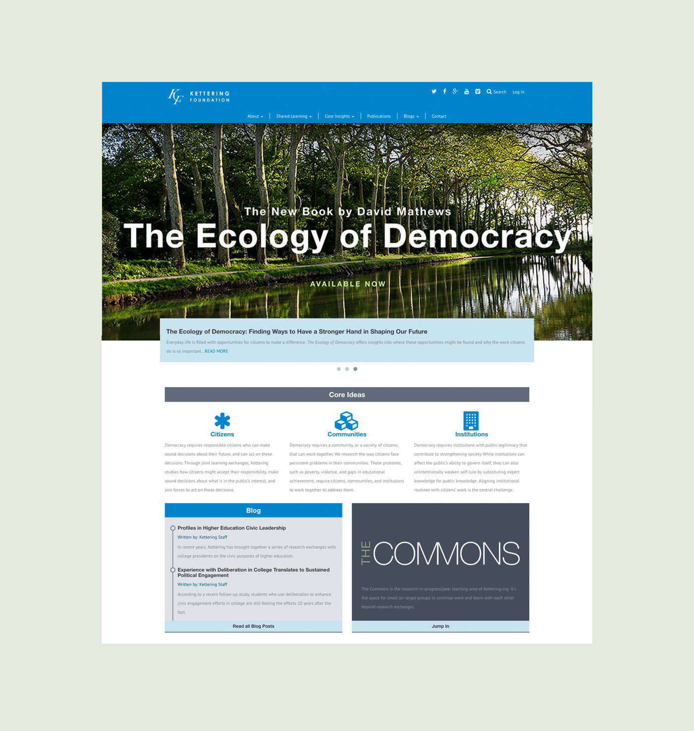
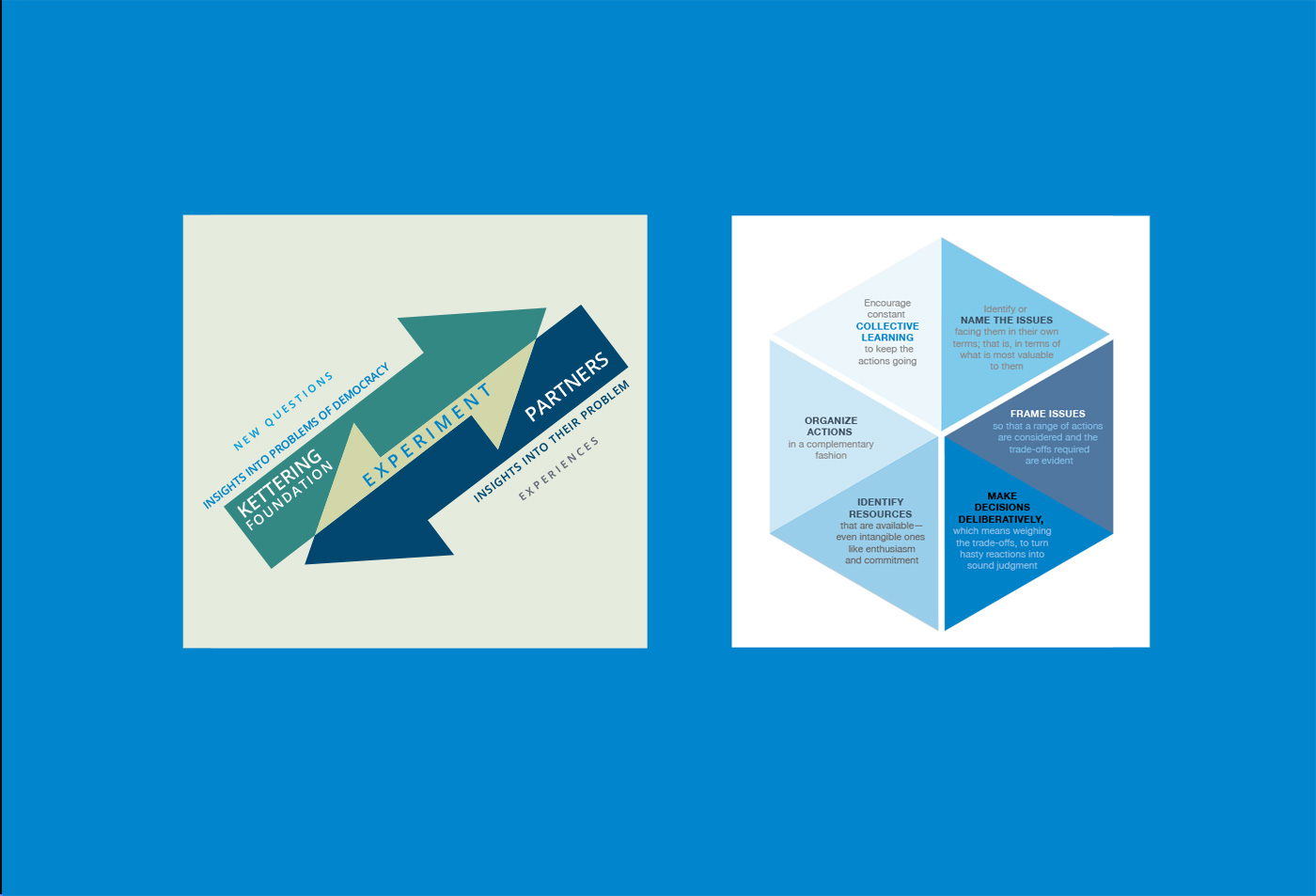
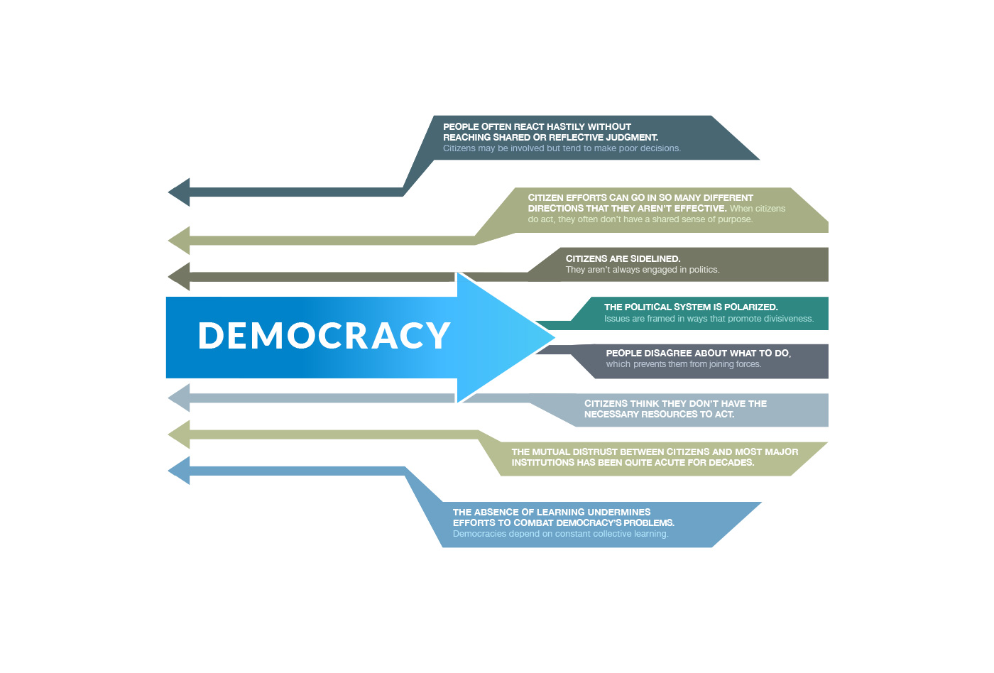
Writing materials to help people understand how democracy works while collaborating with people around the globe is a big deal to the Kettering Foundation. That's why they entrusted us to develop a number of solutions, including a fast responsive site, branded illustrations, event materials, an ecommerce store, and forum software that would allow people to more effectively collaborate.
In order to fully understand the needs of this project, it was imperative that we first got to know what the Kettering Foundation was all about. This is always a vital and necessary first step that we take on every project. It was clear that the Foundation wanted a complete site makeover. However, due to the complexity of their message, their connection with an extremely wide target audience, and the needs involving collaboration, we quickly concluded that we would need to do additional research so that we could provide smart recommendations.
We began by creating and conducting a usability study of the current site. An online survey was given to a wide sampling of the target site users, Foundation researchers, administrators, and other stakeholders. We quickly concluded there was a big gap between what the experts were saying and what users were taking away. There was an intense amount of information being conveyed without a clear, well-branded hierarchy or user-friendly navigation. In short, the site as very busy and hard to navigate. The study showed that while people could tell there was a lot of information, they quickly felt overwhelmed and lost.
Because the site was very content heavy with information written by some of the most respected researchers in the country, we knew how important it would be to compliment it with a good clean, well-branded design — one that could be used throughout the site development and beyond.
Using an Agile process, we worked as a team to define an easy-to-follow navigational structure, surrounded by a simple and professional design theme that would allow the site to breathe. It was important that the user experience hold up on a wide variety of devices, so a responsive theme was accounted for during each step of the process.
To accomplish the site goals, there were three layers of the site: an informative area for discussing what the Foundation does and does not do, an ecommerce area where people can purchase downloadable or printed versions of research products, and a custom-built forum to facilitate workgroups and encourage collaborative discussion.
The entire site was constructed using Drupal CMS, and custom PHP coding, which allows the Foundation to make their own changes to the site, maintain products in the store, and collaborate with a large number of research groups.
